Sense website home page

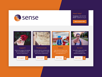
A challenging project for Sense a national charity that supports people who are deafblind, have sensory impairments or complex needs.
This is an initial study for their home page focusing on accessibility and smooth user experience. One of the goals is to specify and split the user experience into four different user journeys based on the different target audiences.
The page's design and structure are deaf, blind and color blind friendly with large, clean, interactive areas created for people with motor disabilities.


