


Network Dashboard


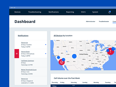
Here's another shot of our Network Visualization Dashboard. We focused on creating a design language that's bold, clean, and doesn't overwhelm users who work in the software every day.
For this project, our design decisions had to comply with AAA accessibility standards. This means we had to be conscious of keeping things clear and obvious while making sure our typography and color choices met specific contrast ratios.


