Sketch layers redesign


I've been thinking a lot about design tools recently. And sometimes I like to pick a certain issue and try to come up with ways how to do them differently and maybe improve upon them.
This time I picked Sketch's layer list. I get lost pretty often within my artboards. Dozens upon dozens of groups, symbols, shapes, text and so on. Most of the time I can't tell which group certain layers belong to. I remembered an article about a Sketch redesign a few months back (done by Eder Rengifo [0]) and used some of the changes for the rework.
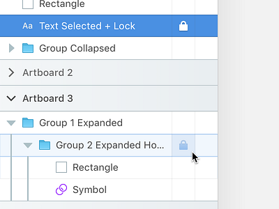
Full changelog (see attachment for 1-to-1 comparison):
- Increased artboard cell height to 36 points (from 27)
- Increased layer cell height to 32 points (from 27)
- Increased font size to 14 (from something like 11)
- Introduced strict 8-point grid
- All icons now in a 16x16 grid
- Removed alternating rows; introduced dividers
- Brightened color scheme (to separate sidebar from canvas more clearly) and darkened artboard items (to differentiate between artboards and layers)
- Introduced branches (as in a tree structure) to show the layer hierarchy in groups (thanks Eder)
- Changed artboard expand caret from the default arrow to differentiate between artboards and layers (I came up with the idea when I saw Eder's design and his custom carets)
- Changed symbol icon (really unnecessary, but I liked Eder's)
- Introduced cell-wide hover effect
- Introduced Lock and Hide options as separate button columns to make them visible at all times and clickable independently (this could work responsively that would only appear upon a certain width and before would work like the current version)
I find cell heights and font sizes to be very, very important, but most of macOS seems to be about minimizing click area and affordances – for whatever reason. That's why I think having an additional larger click area (despite visual differences to the icon sizes) would be great, as right now it's pretty hit and miss (pun intended).
I know that changing width and height would impact laptop users, but I find the gain in readability, usability and accessibility more important to balance those out.
These changes were made on the feedback and in collaboration with other designers.
Let me know what you think. Is it terrible? What could be better? Would you like to see some of these changes in the software? Did I forget something?
[0] Eder's article: https://design-nation.icons8.com/re-designing-sketch-18ff779b1dd7


