Primary Visual

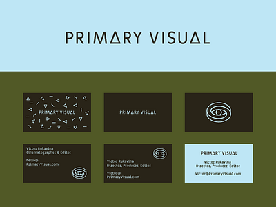
Updates to the Primary Visual brand.
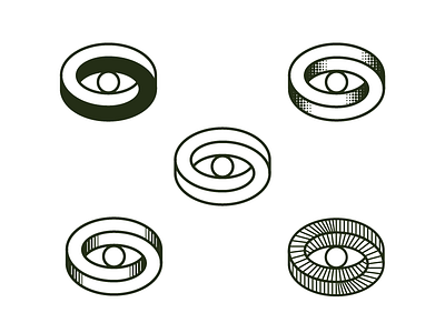
Client wanted a more memorable workmark. The font I'm using has a triangle glyph that I leveraged and tweaked the "I" a bit—to hint at the idea of "rods and cones" and add more visual language. Client is still considering the color options.
Tweaks/kerning left and more to come.