VigorOne New Packaging HELP!

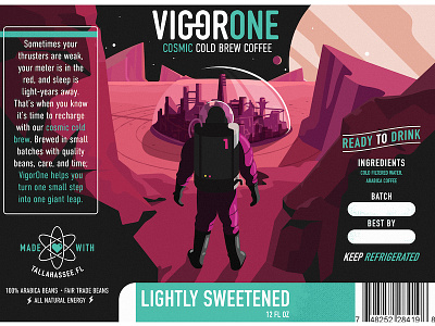


Alright, here is the newest direction for the cold brew packaging. It will be wrapped around three sides of a square-ish bottle.
The overarching story is that there this sci-fi astronaut scouring galaxies and planets bringing VigorOne Cold Brew to new cities. The pack on his back is supposed to be a tank full of VigorOne (hints the "1"). Just looking for some helpful feedback like:
-Can you tell what's going on in the illustration
-Are the colors too funky?
-Thoughts on the text layout? Probably the my worst area is layout so recommendations would be incredibly helpful.
-Check the attachments for a more "normal" color scheme. The idea is that for every flavor, the accent color of the text will change.
Been looking at this for too long.


