Black Magic Creative


So excited to reveal my finished logo for Black Magic Creative! This baby has been a long time in the works.
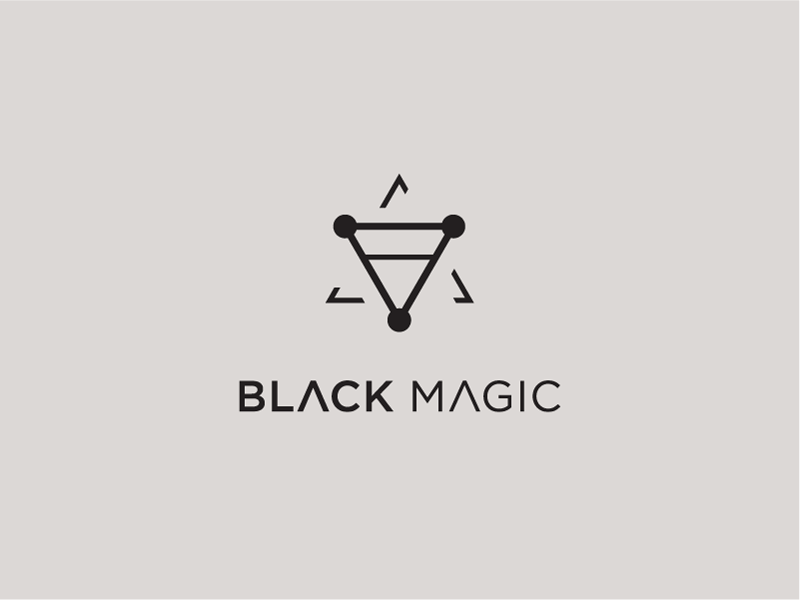
Black Magic Creative is a creative studio which caters mostly to retouching clients but hopes to eventually expand to other creative mediums. Their identity is simultaneously alluring, mysterious, and cryptic, nodding to the behind-the-scenes process of creativity which often culminates in what appears to be magic.
The logo itself is a blend of three alchemical symbols: clay, moon, and fire, each representing different parts of the creative process. Clay represents the act of creation, as well as the importance of form. The moon represents the mental aspect of the creative process: creativity, mystery, and intuition. Lastly, fire represents rebirth and purification: the refinement process
We'll have more exciting pieces of this identity suite coming soon!


