Dineout UX Improvement


I'm a regular user of Dineout and I feel it's an amazing way to book the table with some cashback on bill. 🙂
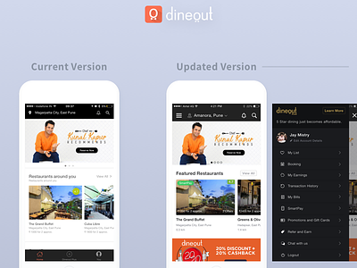
But UX is pretty confusing, so here's my take on minor but effective improvements.
Below are the problems I face and I've solved it.
- I feel bottom menu is waste of space and not adding much value.
- I'm not sure if I can pay with SmartPay feature until I dive into detail page.
- I'm not sure how far the restaurant is from my current location.
- I don't know how many offers at the particular place until I dive into detail page.
Please share your thoughts if I'm missing something or any suggestion. 🙌🏼


