Stallion Capital | Saint Vincent

Here's a little behind the scenes for one of the logo options for the investment group, Stallion Capital.
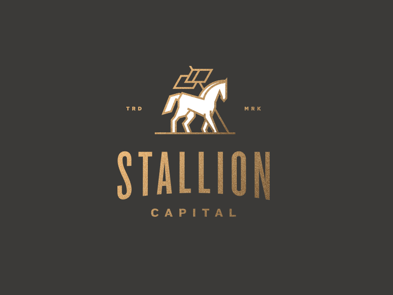
The first challenge was removing almost all the curves that are natural to a horse. The end result I was going for was a stance that implies strength and security. I tried to limit myself in the construction of this mark. It's made up of four diagonal lines, vertical and horizontal lines on top of a triangle base (which is implied with the flag pole and the ground plane).
The goal in this option was to create a mark that addresses the insecurities that are native to the finical investment industry.


