Temporal heat map

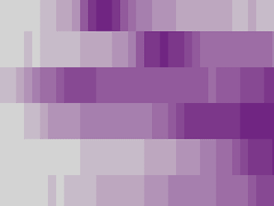
This is just a preview of a little something I'll be publishing next week! There are lots of ways to show temporal (time-series) data, not just line charts! In this case, the darker the color, the more stuff is happening at that given time. Picking the right color scale is key, though!


