Investment Comparison Graph


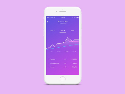
A graph for the Wealthy iOS app that showcases the difference in portfolio returns across other investment methods. Hope you like it!
A graph for the Wealthy iOS app that showcases the difference in portfolio returns across other investment methods. Hope you like it!


