unused design


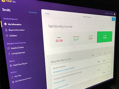

Here's an early UI mockup for the app. We didn't end up going this direction, but I still liked the purple wrapping the chrome. It just ended up being too heavy in the end.
So, we incorporated custom iconography, lightened everything up and brought in the illustration work to make it feel more cohesive. All the colors were a little too saturated and playful, so they needed to be reworked. The purples became closer to blues, and the reds closer to red and less pink. The greens were brought down a lot to help with contrast against the white.
Check out the attachments to see some of the revisions and brand concepts.
Also, we've been trying to post more frequently, so if you like what you see, give us an L.


