Badoo cards redesign

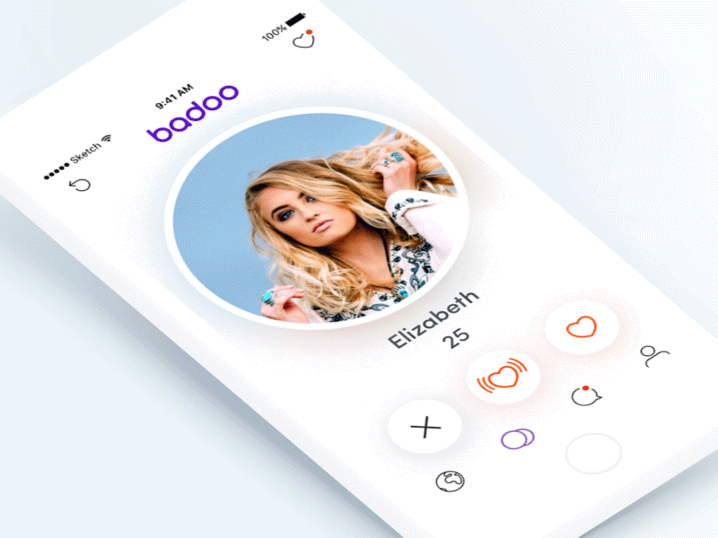
Badoo introduced a new feature - cards, and to me it could be better:
• User picture. Instead of rectangle shape, I’d use the familiar round shape to keep in line with brand identity as well as to be easily distinguishable from the competition.
• Buttons. Instead of placing them in swipe grab area and removing after the onboarding, I’d place them under the card, so they do not interfere with other possible user actions and are all located in one place. I'd also keep them present at all times, as it gets tiring to swipe after some time.
• Interaction patterns. Instead of having different patterns for the same type of action (for “Dismiss” or “Like” there is either a button (at the onboarding stage) or swipe, but for “Crush” there is only a button), I’d make swipe up as a non-button interaction for “Crush”, so there is the same interaction pattern for all the card actions.
• The action confirmation. Instead of having it coming from the opposite side to where the card is going, which is confusing and eye hurting, I’d place the confirmation badge on the profile picture, so it’s easily understandable what it relates to.
• The additional information. I would not include information, like education and work, so that the user is not overwhelmed with non-essential content on the preview screen.


