Twitter Redesign: Icons

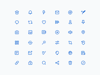


As part of the recent Twitter design refresh, we updated our iconography to unify the set and to better communicate on/off states. The default state now uses a stroked version and selected state is filled.
Icons fill a 20px live area with equal volume and don't extend past the larger 24px bounding box. Shapes can extend into the padding between the live and trim areas if additional space or visual weight is needed.
Also attached is a look into our process for reimagining the home icon. By stepping away from the computer I sketched as many different types of houses (and bird houses) as possible. Ultimately we decided to simply refine the existing icon and keep the bird metaphor.
Thanks all for the great feedback we've been receiving so far!


