


Transparency - area chart


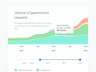

One of the infographics from the re-launch of the Dropbox Transparency Reports. This chart depicts the volume of government requests over time, broken down by request type. It's not perfect, but I'm damn proud of the job my team did. Shout out to Fanny Luor for the illustration work, and front end engineer Kevin Weber who did a killer job on the build of the infographics (he kicked so much ass on this, it's not even funny).
Attached also is an export of my Sketch design (ALL shown data is placeholder dummy data... check out the real thing to explore the actual reports).


