UrbanClap Partner New Leads


We are currently amidst doing a major visual redesign of our Partner app (used by our professionals).
Long description
1. Right information
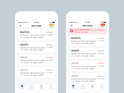
Prior to this, we had been showing static data to all the pros: Category name, location, distance, the number of responses and number of credits required to respond to a lead.
With this, we are moving to category specific information that a professional will find useful while skimming through a long list of new leads.
For e.g. a Fitness Professional finds the locality, time preference of the customer and approximate budget helpful while choosing a lead he/ she'd be intered in.
2. Highlighting information when necessary
In a dark themed UI, there were elements that were fighting for attention and it became extremely difficult to highlight a new information for the pros. Readability and skimming took a huge hit!
With the light UI, we have kept the focus only on the leads and whenever there's an important info that needs to be communicated to the pros (e.g. low credit balance), we can bring it to their attention immediately with a highlighted color.
More details in upcoming shots.


