Comcast Liftlabs


This is a branding project I'm working on at VV, for Comcast's entrepreneurship hub called liftlabs. This poster concept is included as part of our moodboard(shown in the attachment).
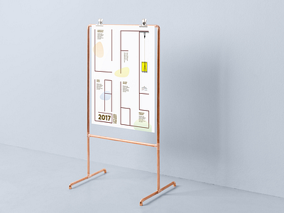
In the poster, the linetype("liftlabs") is used as a structural element for the layout, symbolizing liftlab's supportive nature. The yellow elevator is little fun brand element taken from the literal meaning of "lift".
The fluid colorful blurbs exist to break the line-heavy layout as well as carry through comcast's brand colors.


