Asavie Moda Data Usage Charts

Asavie Moda dashboard data usage charts. Powerful reports allowed admins to see how much data employees' devices were using and which website they were visiting.
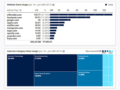
Bar chart on the top shows which websites consume most data. Total MB used and percentage of total data consumed.
Treemap on the bottom displays data usage against internet categories. Drill down to see which websites in each category consumed the most data.


