TARC | Rebrand


I had the pleasure of working with TARC, a nonprofit that provides care and guidance for individuals with disabilities and their families.
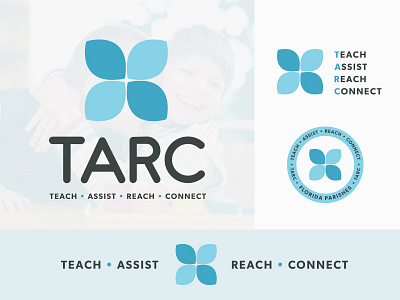
The goal of the rebrand was to create a fresh and uplifting look. In addition to creating the logo we also created a new meaning for TARC: Teach. Assist. Reach. Connect.
The Logo mark itself is abstracted from a butterfly, which symbolizes the personal growth and development that TARC provides to children and adults with learning disabilities.


