MUTEMATH / Play Dead US Tour Poster (and behind the scenes)

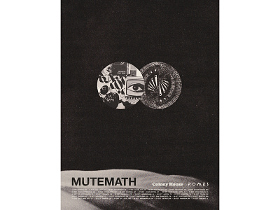


Tour posters are very hit or miss for me. Truth be told, there are few I'd ever consider hanging on a wall. Overall, I tried to maintain a "less is more" approach to the US poster, and I really enjoy the end result.
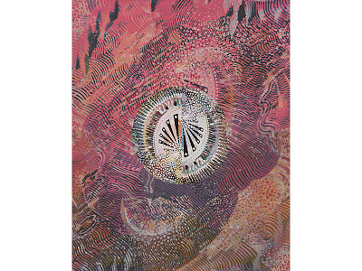
I tried a number of directions that were very "traditional tour poster" with large type and huge graphic presence, and I kept coming back to wanting to do something that was against the grain to the rest of the album/tour campaign. Upon browsing Google for vintage ads, I found this advertisement from 1962 that inspired me to incorporate the album artwork in a way that could be related to the album art without being so literal.
One of the subtle things I explored to bring some authenticity to the poster was printing off the logo, rubbing it with a damp Black Tea bag, dabbing it dry, and then scanning it back in. Processes like this tend to help me rethink my approach. Early on in the poster design process, I was holding on too tightly to what I had done with a lot of the other promo stuff. This simple "remix" of the logo got me thinking outside of my direct context and helped me push past some of the creative block I was having.
Anyway, probably more info than anyone cares about.
Happy Labor Day!
✌️