Metropolitan Transit Authority - Landing page


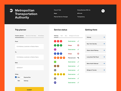
I wanted to challenge myself by redesigning something information heavy and dense in a short amount of time. Since I had some time off between projects I had a crack at the MTA website.
The current http://www.mta.info/ is pretty dense and outdated so I used a wider grid, removed some of the unnecessary chrome around the information and gave everything a little refresh while still trying to make it very usable and accessible.
--
hello@bien.studio 👋 www.bien.studio
Get in touch with us, we're looking for new projects and partners.


