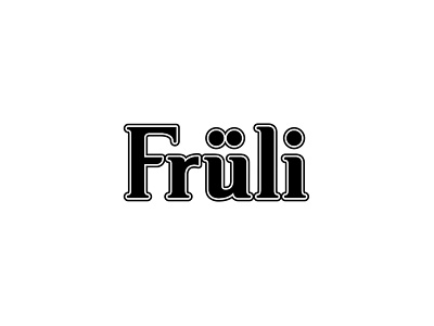
Fruli
This juicy brief required us to update the brand logo and the primary packaging without losing any of the brand cues already recognised by the existing consumers. The evolutionary approach to the re-design involved softening the existing logo by rounding the serifs and aligning the base line of the letters.
The full project can been seen at http://www.garyeley.co.uk/fruli
View all tags
Posted on
Sep 21, 2017
More by Gary Eley View profile
Like


