Logo Refinements - Any Feedback?

Hey there,
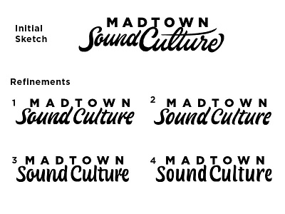
I'm working on this logotype for a friend, and could use some feedback.
The initial sketch at the top was selected from a few options I whipped up, and now I've created 4 refinement directions.
There were a few thing we wanted to reconsider moving forward with refining.
•The words Sound and Culture need to have more even color throughout the letter spacing
•The word "Culture" reminded the client and his business partners of the "Culvers" frozen custard logo. And the word 'Culture' could be cleaned up (Which I understood as legibility)
•They wanted to see a version where "Sound Culture" is not cursive.
To solve the "Culvers" issue, I removed the connection between the 'C' and the 'u', and got rid of the open looped 'l'
I then explored a range between cursive and printed letters. Numbers 1 and 3 have some letter connections, while 2 and 4 the letters are completely separate.
The separated letters have a nice legibility, but I do enjoy some of the nuance in the connected versions.
Any feedback on what is working or not working?


