HelpSpot Branding


HelpSpot needed a branding update. They're the original help desk software and have been around for many, many years. Their brand has held up pretty well but they wanted something more modern.
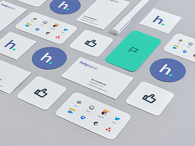
We made a bold move and changed from blue and orange to purple and green for their brand colours. ALL their competitors seemed to be using blue so we really wanted to stand out.
Here's some collateral examples for their new brand and you can see the final logo in the attachment. Would love to hear what you think!
----
Learning design? I'm creating a course on design for developers where I distill my process down into easily repeatable, learnable chunks.
Learn how to make your apps not look pants without going to design school!


