Atlanta Lindy Exchange

Working on a simple design for an upcoming swing dance / lindy hop dance in Atlanta. The idea is to evoke a retro Atlanta feel without being too specific to a time period.
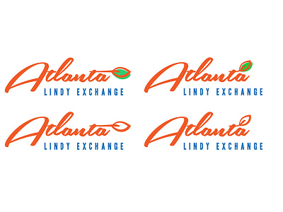
The Leaf attached to the 't' is meant to evoke a peach leaf (as Georgia is the "peach state") and trees in general as Atlanta is also the "city of trees" — previously I tried to go for a full-on peach theme but it felt too specific.
I decided to go for a sharper, darker orange and a desaturated green that has kind of an "older" effect, but not sure how that turned out. The green leaf on the right is slightly more yellow / saturated than the one on the left.
Typefaces: Southern Aire ("Atlanta"), Headline One HPLUS ("Lindy Exchange")
I'm actually a UX designer and not a graphic designer by any means, so any feedback is appreciated!
Thanks, everyone!


