On Typography

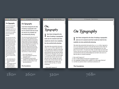
Started building this mobile first “boilerplate” that tries to make a good starting point (this is the reason for the very plain look) for typography that looks balanced and easy-to-read on wide range of devices. It works from 200px and up and provides a set of media queries and typographic basic styles. All proportions are based on The Chromatic Scale.
I basically did this as a personal study, but decided to share the results in case someone finds it useful. If you want to know more about it read my post at http://viljamis.com/blog/2012/typography/ or check the GitHub repository https://github.com/viljamis/Scale


