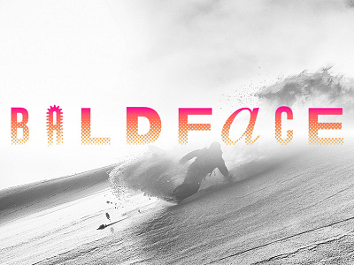
Baldface: The Temple of Snowboarding Logo
Last fall one of my first projects out on my own as a freelancer was doing the design, art direction, and construction of an interactive story piece with Volcom, Gore-Tex, and Teton Gravity Research called Baldface: The Temple of Snowboarding. Baldface Lodge is a snowboarding mecca tucked up in the mountains of British Columbia and this project is the story of its enigmatic founder Jeff Pensiero and the crazy series of events that made Baldface the legendary place that it is.
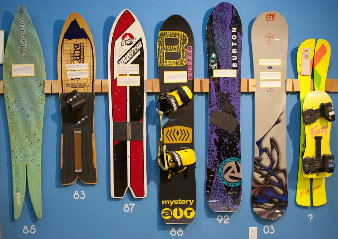
This was a killer project to get to work on: tons of creative freedom to take it in any direction and a great crew of folks providing the story, images, and support to get it done. From the start I knew that I wanted to pull from the very roots of snowboarding - the wild post modern graphics of vintage boards from companies like Burton - and embed those motifs into the story and art. It needed to feel rebellious, vintage, and true to the soul of the sport.
That process started with the branding for the project: what could be more retro cool than the ultimate early 90s anti-design logo? Bold letterforms, mixed font-widths and styles, and absurd tracking, combined with an eye-watering magenta gradient and the logo was born. And yes, that is the italic 'a' from Times New Roman, just to really stick it to the man.


