Beeenz!

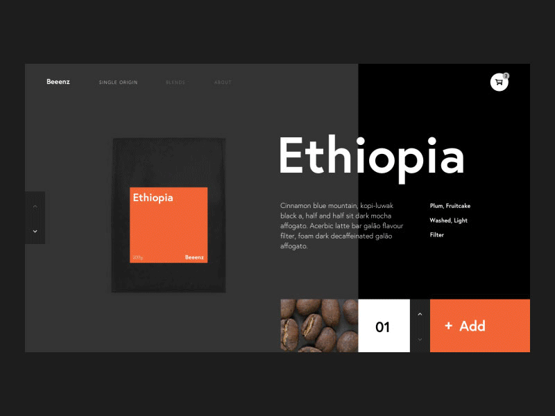


I've stopped drinking coffee for the last few days to see what happens … so far only headaches. As a masochistic substitute I created a product page for a fictional coffee roaster.
I wanted to take the Mondrian trend picking up here and incorporate it into a slight less esoteric UI.
The animation serves to direct attention and accentuate the hierarchy. There are a lot of moving elements but the main heading lags slightly behind the other transitions to provide a final resting point for the eye. The cart pulse animation gives feedback without being intrusive like a popup.
When buying coffee at a roaster I like to see the beans, You can get a feel for the taste from looking at them. I included that detail to bring an element of the physical transaction into the digital.
I prototyped this in Principal and I am still tossing up whether it is easier to use software or just jump straight to code. Would like to play with a live demo for mockups like this or is a gif all good? Let me know in the comments!


