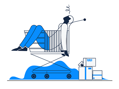
'No Orders' Empty State Illustration


Hi guys!
As you might already know, here at Zajno we are currently working on an iPad application for a new electronics e-commerce store. What you see above is an empty state illustration I created so that it could pop up when a user has no orders in the cart.
It is commonly believed that an empty state is a thing of minor importance because it’s only a temporary part of the user experience. However, we believe that well-designed empty states can drive engagement, delight and retain users at critical moments. Little things are big, so paying attention to details is an essential component of quality design.
This is the second empty space illustration we created for the app.
You can see the first one here. We made them both minimalistic and informative as it was the key requirement for the application design on the whole. That also included using a narrow color palette which consists of the main app colors: white, blue and dark gray.
We ended up with a simple, clean and informative illustration that adheres to the app’s overall stylistic and livens it up a bit too.
Press "L" to show some love!
ᗈ Join our Newsletter!
ᗈ Website
ᗈ TheGrid
ᗈ Spotify
ᗈ Twitter
ᗈ Medium
ᗈ Facebook
ᗈ Instagram