SPACED Logo 🌕 🚀


Here is my proposal for the SPACED logo.
I also wanted to share with you some of the reasoning behind my design choices, so if you have a minute keep reading and let me know if you agree or disagree and why.
I focused my attention on the promise of the tagline "To space and back, safely." The service provided by SPACED is no road trip to Disney World, so each word of the tagline is extremely important. Some people may even say a matter of life or death.
Font
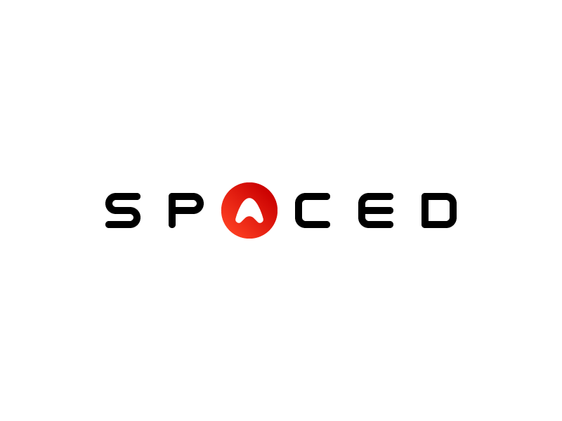
For my font choice, I ended up creating one from scratch to make sure I would get all the details that I wanted to cover. I knew from the start that I was not going to use sharp edges, and none of my letters will look as if pieces are missing. Rounded edges evoke warmth and trust. SPACED being a company offering competitive pricing on an out of this world service, you want to make sure that people feel they can trust you, that competitive pricing doesn't translate to less safe.
As tempted as I was to play with some of the letters to give the logo a more futuristic and edgy look, I feel like removing parts of the letters can give the wrong idea. Showing a logo without any missing pieces is my way to reassure the customers that when SPACED says "To space and back, safely," they mean every single word of it. No half promises.
Colors
The primary colors are black and white. As an accent color, I added a red gradient that was created combining two shades of red from two groundbreaking futuristic companies. NASA and Tesla.
Additional Elements
SPACED promises a safe experience, but that doesn't mean it can't be fun. I wanted to give the logo some life by adding some playful elements to it. A rocket-shaped letter A inside of a circle that keeps it safe is my way to find that balance.
Let me know your thoughts!
Also, don't forget to follow me on Instagram, Twitter, and facebook for more fun!


