Spiral visualization - Data and Beauty _ V2

Hi Pals,
This's a brief motion in Dribbble was limited in 8mb and please feel free to watch a full version here.
Goal:
Today graphics apply multiple shapes and colour to cover up a paucity of data. The essence of user experience is analytical thinking that how the user can visualize data with aesthetic and minimalist design.
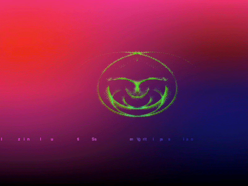
I'm in the middle of preparing a site for data visualization and as of way of building the shape of the spiral, each line, twist and rotating are actually has each number along with it.
Elsewhere:
-Motion graphics/Interaction
-Design Concepts
-YouTube
-UX tweets


