Design Mocks for Fuel Company

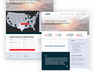
I'm really excited to start adding color to these wireframes I posted earlier. By leveraging their primary palette as accents and leaning on gray and blue tones, we were able to effectively draw the eye to conversion points and forward paths while leveling up the brand to a more modern aesthetic. Cannot wait to see these bad boys live.
See all screens at: https://invis.io/E7TP1AKSRFU


