SPACE-D Logo


@Dann Petty's #SPACEDChallenge #spacedchallenge
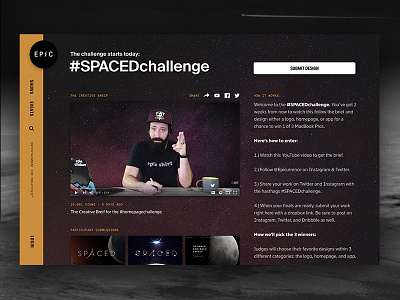
When I was creating the logo, I aimed to state dinamic, pure and simple expression that adaptable with briefs content. I wanted each letter in the logo to represent a planet, thats why letters were formed from bold to thin to gain identity. With alieneting fonts, I wanted to create the sense that their distance between at the outer space.
Using their individual dinamics for each, fonts are meant to be compatible as a whole, and I wanted for the logo to be strong, technologic, minimal and easy to read. Between the word “Space” and the “D” letter, dash is not a bracket, it represents that the firm travels to other planets.
Press "L" on your keyboard if you do not want to.
Background image: Art Bully Productions
Big image: https://lockheedmartin.com/content/dam/lockheed/data/space/photo/mbc/MBC_MADV_Lander-2.jpg


