SPACEDChallenge - Brand


How should a outer space travel company communicates to their audience? How its brand should look and feel like?
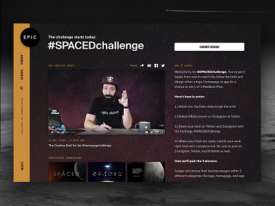
Inspired by this questions I joined the #SPACEDchallenge, by @Dann Petty. Pretty fun and mind blowing design challenge, that really made me lift off from my desk and search for inspiration beyond the everyday office design tasks :)
My goal was to achieve a match between typography + symbol (kind of mascot). The "SPACED" word, even with the customization to look like a glyph from a alien language, seem to miss some human feeling when presented alone. That's when the little helmet guy appears.
Took inspiration from brands as cool as SPACED, like SpaceX, MailChimp, Tesla and Virgin America.
You guys can check the animated version at my Instagram, and the variations + applications of the brand in the attachments.
Good luck to everyone, space cowboys! Looking forward to seeing everyone's submissions :)