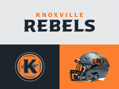
Knoxville Rebels


Team 19/32 of #TheUFLProject – the Knoxville Rebels.
The Knoxville Rebels franchise bears a nickname that stems from a slew of backgrounds. Historically speaking, Tennessee was classified as a Confederate State and was home to many critical battles fought by rebel soldiers in the Civil War. Furthermore, the state animal of Tennessee is the raccoon, an animal with a reputation of mischief. The visual focus, however, leans on the reputation and culture of moonshining (producing high-proof distilled spirits, often illegally) in the Eastern Tennessee regions.
The Rebels color scheme features the abundant Tennessee orange, paired with two shades of smoky gray derivative of the morning fog that rolls of the nearby Smoky Mountains. The primary “K” logo and team wordmark are inspired by vintage distilleries and their use of flourishes and rustic treatments. On each jersey shoulder is a unique stripe that mimics the shape of Tennessee, with the custom number font and team typeface using these same visual cues. The mascot logo (attached) represents a rugged moonshiner with an uncouth appearance.
Side note: This team in particular was a ton of fun to work on. I had the opportunity to visit Knoxville and Eastern Tennessee earlier this month and absolutely loved it.


