Citra Beer Label

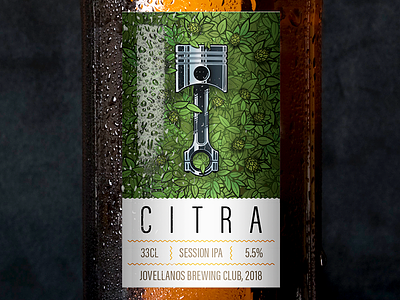

After several iterations I felt that it was best to let the illustration shine. I like the results because it hit the spot of looking more like a wine label than a beer label.
I researched different labels, and for some reason beer labels oftentimes rely on typography mainly, all the illustrations seemed to support big letters around the label that seem to take all of the space on the label. On the other hand, wine and sparkling wine bottles have more delicate and minimalistic labels, where whitespace and balance make the few elements on the design stand up.
I considered that this homebrewed beer could use that elegant style, to contrast with the toughness of the piston and the origins of the beer.


