Student Visualization


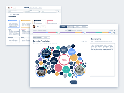
This visualization shows the connections for multiple courses and skills. The reason is to show students that a lot of their experiences involve similarities they may not usually notice. The largest circles represent the courses/main skill their visualization is based on. The rest of the circles scale based off how many 'connections' that piece of data has based on the courses and main skill. These circles represent color coded skills. The smallest circles are only a skill for the course that it is near. The UI in the back represents saved notes based on each of the connections.
Design team: @Eddy Gann @Michael Abbate