Flowdock Icon

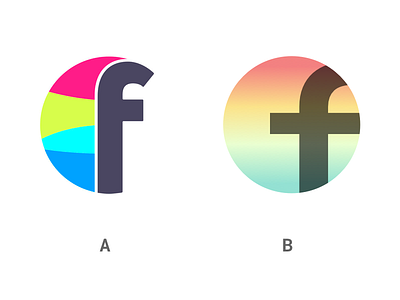
I could not resist to redesign the existing flowdock icon. Since I look at this icon every day my eyes where searching for some calm and clear shapes and smooth colours/gradients.
Which one do you prefer and why?
A Existing Icon
B Redesigned Icon
Happy for any rebounds.


