


Fearless

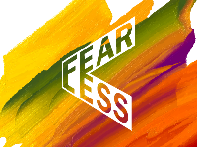
A brand created for a local TEDx conference theme - Fearless.
This was an interesting challenge to create a brand that embodied the spirit of the conference, which is to be fearless…
The full brand (I'll post examples soon) combines bright, bold colours with a logo that in its self is standout, but also nods towards the 'less' by means of taking the form of a less than symbol (<).
The idea being to show that to be fearless is to be brave, to not be afraid to colour outside the lines, to use bold colours (in as much of a metaphor as opposed to the literal interpretation…)


