Befresh Brand Identity - Icon

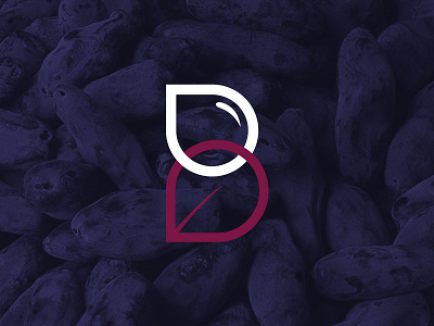
This is the icon from the logo I designed for Befresh Haskap Berries. The brand it's apart of was meant to not only promote awareness and the cultivation of this relatively unknown berry, but to also represent on a deeper level how itself and products made with it could be associated with living a more healthy and prosperous life. Consisting of an interlocking water droplet and a leaf, the icon is meant to convey the symbiotic relationship inherent in not only the growth of the berry, but also the physical, mental and spiritual growth in people associated with living well.
Unfortunately the identity in this form was not able to be used because of naming rights, but I still decided to flesh out the rest of the concept I had for it. If you're interested, the project can be viewed in it's entirety on Behance.
https://www.behance.net/gallery/23753089/BeFresh-Branding-Identity


