Reddit logo experiment

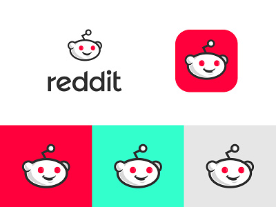
The reddit logo is somewhat untouchable. It doesn't really belong to any one individual to alter, it belongs to an entire community that has crafted it's current guise into thousands of variations. It has so much simplicity that it can even be perfectly rendered in MS paint. Qualities like these have given it's users a powerful sense of ownership.
Politically, rebranding reddit with a new, shiny web 2.0 branded veneer would never really work, but as a user and a fan, I thought I'd experiment with some artistic licences.
So here's a quick little experiment I ran on a redrawing of Snoo for an updated reddit logo alongside a quick logotype, designed to mirror the angles of his infamous antennae.
Colour wise, as Snoo is an alien, I thought some vibrant, artificial colours could help communicate his origins better.


