Breakzy Card old vs new

Don't you love it when you get the change to improve on your old designs?
With all the things going on in projects, especially with startups, it's almost impossible to get it completely right the first time, right?
The cards shown here are what you see when you hit the road using the Breakzy app.
The ‘onderweg’ (on the road) tab of Breakzy shows you a list of pitstops coming your way. These can be gas stations, hotels, restaurants, theme parks even.
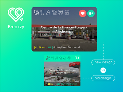
The card displays a photo of the location, what kind of pitstop is coming your way (first icon left), with next to it a short icon-list of facilities like a coffee corner, a playground for kids or a charging station for electrical vehicles.
In the right top corner it shows you whether this pitstop is in your favorites list (the heart) and an overall rating (the number in the green circle). On the bottom there is some information about distance, highway number and direction.
The old card functioned well, but I knew there was room to make it less distracting, more balanced. Especially now that the card is used in more occasions than just the list.
New devices with larger screens gave me some more space to work with, so luckily it was easy to add the favorites-functionality. I did not change the height of the card however; I didn't want users to end up scrolling more.
I've got rid of the green bar on top and the dark transparent bar on the bottom. Now the card is filled entirely with the photo. The main text and icons are now white, giving it a more solid, coherent look. A bit more refinement on the shadowing supplied the right contrast for the information on the bottom.
I think it turned out pretty solid, it's still distinctive ‘Breakzy’ but more balanced out and with less clutter.
What do you think? Do you still see room for improvement? Love to hear!


