Experimenting with Radar Chart

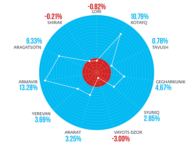
Radar chart is one of the useless things widely used in data visualization, but never finding its place in my works. This is the first experiment inspired by Alberto Cairo's Brazil election chart made years ago.
Verdict: looking nice, but the viewer needs time, along with additional "How to read this" legend to decode the data.


