New Reports Color


While updating our color palette, accessibility was one of our top priorities. Mixpanel is an analytics tool, and data needs to be clear and easy to understand. One of our customers' biggest pain points was being able to discern different segments they were viewing, especially when looking at our Dashboard's product on a television screen across the room.
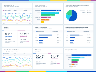
This shot is the updated palette we'll be using for our reporting tools, like Insights, Funnels, and Dashboards, among others.
Check out the attachments for before and after shots, as well as the final six-color palette.
Oh, and we're hiring!


