Homepage Design for an Extreme Travel Agency


Hi guys!
This is the website homepage we are currently designing here at Zajno for some friends of ours who run a rad travel agency that offers tours to extreme destinations. I mean, isn’t it rad? And pretty tempting too. Would be cool to explore some of them!
Goals Our main objective was to present the travel agency to the public creating a thought-out, minimalistic design that matches their rad nature and showcases the main info about the agency and their tours.
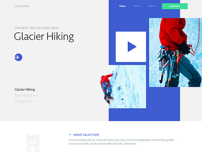
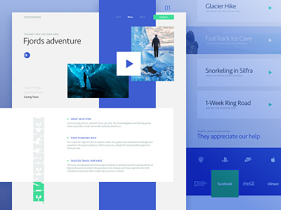
Approach On the page hero shot, users will see a slider that shows photos/gifs of different extreme destinations. As one of the requirements was to apply a minimalist design strategy, it was decided to present the main info on each tour and the area by showing video users could see without leaving the page. You can switch tours by clicking the buttons in the bottom left corner of the hero shot. Scrolling down the page, users will learn the benefits and useful info about the agency and the tours it offers. While designing the page, we played a bit with the composition and tried to come up with some unconventional layout. However, usability comes first, so we tried to make it really easy to interact with the page.
Results We ended up with a pretty clean and smooth homepage design. Think it came out pretty well, but I’d love to find out what you think of it. Share your ideas! I’m all ears! :)
Press "L" to show some love!
ᗈ Join our Newsletter! ᗈ Website ᗈ TheGrid ᗈ Spotify ᗈ Twitter ᗈ Medium ᗈ Facebook ᗈ Instagram