SurgeMaker · Dataviz Hover Details

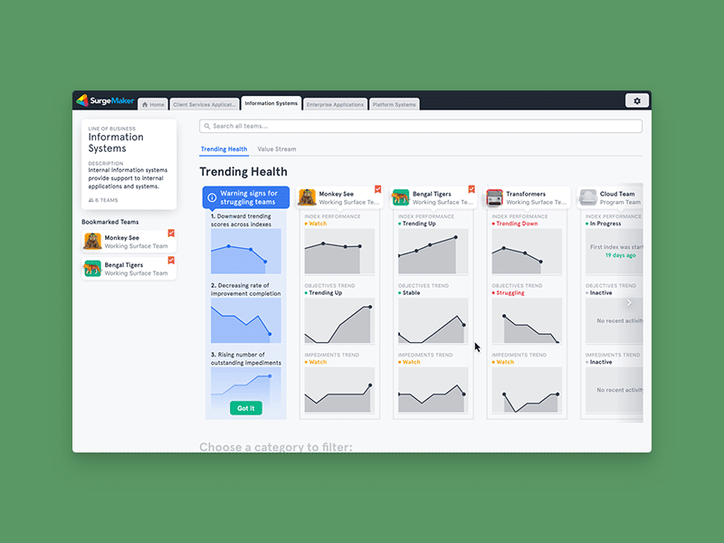


A little interaction of part of a bigger data-viz project. How do you show the (necessary) legend and axes when there are 20 graphs on the screen at once?
Each row uses the same axes, so by hovering over this graph, you can then use that same scale to compare to the Objective Trends in other teams.
Click the attachment for some context!


