The t and l of FF Enzo


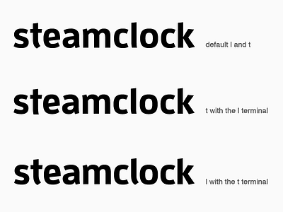
We've been working on a rebrand for Steamclock, and a leading contender for our main typeface is FF Enzo. While Enzo strikes a nice balance between being distinctive yet clear, it has one quirk: the bottom terminals on the "t" and "l" don't match.
This is a quick exploration of two options for adapting the letters so they match. I'm still not sure, but I've been leaning towards the final option: using the "t" terminal on both the t and the l. 🤔


