App Onboarding Screens

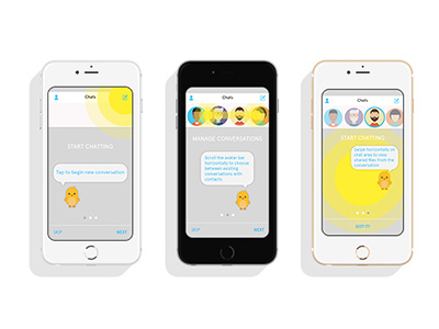
For a student project, we designed a chat app. In user testing, certain built in interactions were not intuitive so I designed some onboarding screens for the user.
As it turns out, 3 was the magic number of screens. Any more was too many and lost the user's interest. Even at 3, some users still don't read the copy.
I used yellow to display what area the copy was indicating in each onboarding screen.


