Daemon Logo

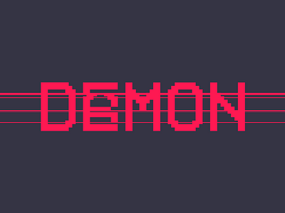
DAEMON's original logo - a cyberpunk / live action game project that blended augmented reality elements with squad-based nerf combat and an integrated story.
The logo was designed to play off scanlines that people typically see in CRT televisions and associate with VHS tapes, while the "A/E" being "glitched" together was meant to show the correct pronunciation of the name and also nod to the cyberpunk aspect of the game. Together, with the bright magenta color, was meant to signify something sinister and demonic.
The name DAEMON was chosen as it comes from a term for a background program - a daemon - that lurks beneath the obvious surface while the system is running. This was a nod to the overall themes of conspiracy and surveillance of the game.


