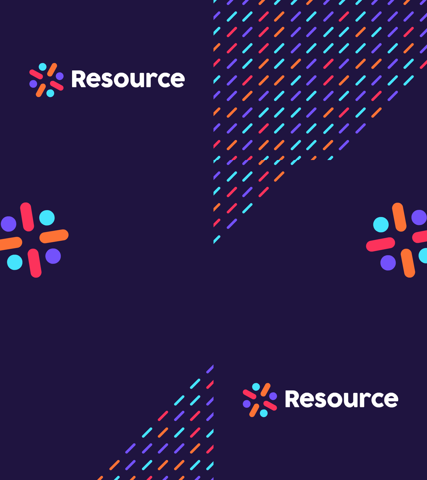
Resource Logo
Had the pleasure of working with Resource in developing an identity for their company. Here's a blurb from the Resource Identity Guidelines:
Color, bright, and strong — the Resource logo is instantly recognizable. The heavier font weight of the wordmark ensures the brand name will be legible even at small sizes. The construction of the icon resembles a person with limbs raised in an expressive and joyous motion. Rotating the icon 90° repeats the human glyph. The colors have been selected so that the cooler hues of the heads establish soft outside bounds while the warm tones used for the limbs focus the eyes towards the center of the icon.
Hope everyone grows to love the logo as much as I have.
Posted on
May 31, 2018
More by John Ashenden View profile
Like


