Status Send Transaction Redesign


Back in January, I've applied for a job position at Status – mobile Ethereum client. The assignment was to analyze and improve the creating and sending transaction process (see attachment Assignment.png).
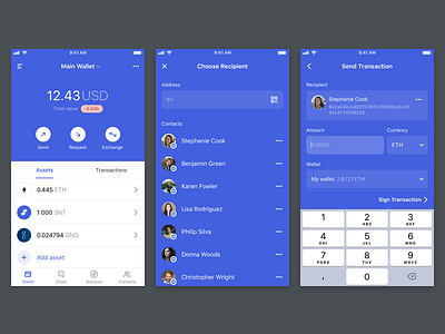
By separation of transaction flow into three standalone screens, I've attempted to make the flow more clear and easier to understand (see attachment Handover.png).
In the first step, a user is presented with a variety of options to choose a recipient. A user can enter an address directly, scan a QR code or choose from a list of contacts – all from the one screen.
In the second step, the only mandatory action is to enter an amount. All other fields are optional.
In the third step of signing transaction, the app displays to a user transaction overview as a last check of the most important transaction details.
I've also changed the wallet dashboard screen, to make action button look like actual buttons, and I've moved transactions history to more dominant and reachable space. Plus little changes on other screens.
This proposal was eventually dismissed by Status, yet I would like to hear your comments and feedback.


